Color is one of the most powerful tools in an artist's arsenal. Understanding color theory isn't just about knowing which colors "go together" – it's about understanding the psychological and emotional impact of different hues, the science behind color perception, and how to create harmony or intentional discord in your compositions.
The Basics: Primary, Secondary, and Tertiary Colors
Let's start with the foundation of color theory: the color wheel. At its most basic, the traditional color wheel consists of:
- Primary Colors: Red, Yellow, and Blue – colors that cannot be created by mixing other colors
- Secondary Colors: Orange, Green, and Purple – created by mixing two primary colors
- Tertiary Colors: Red-orange, Yellow-orange, Yellow-green, Blue-green, Blue-purple, and Red-purple – created by mixing a primary and a secondary color
While this is the traditional painter's color wheel, it's worth noting that in digital art and printing, different primary colors are used (Cyan, Magenta, Yellow, and Black – CMYK for printing, and Red, Green, and Blue – RGB for digital screens).
Color Properties: Hue, Value, and Saturation
To discuss color effectively, we need to understand its three main properties:
- Hue: What we typically mean when we say "color" – the actual color family (red, blue, etc.)
- Value: The lightness or darkness of a color
- Saturation: The intensity or purity of a color, sometimes called chroma
Manipulating these three properties gives you infinite color possibilities. For example, you can create a pale pink by taking the hue of red, increasing its value (making it lighter), and decreasing its saturation.
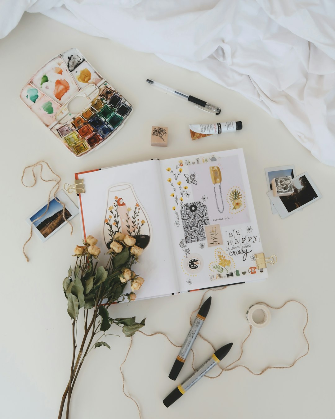
Visual demonstration of hue, value, and saturation changes
Color Harmonies: Creating Pleasing Combinations
Color harmonies are structured ways to combine colors that are generally pleasing to the eye. Here are some common ones:
Complementary Colors
Colors that sit opposite each other on the color wheel (e.g., blue and orange, red and green). These create strong contrast and make each other appear more vibrant when placed side by side.
Analogous Colors
Colors that sit next to each other on the color wheel (e.g., blue, blue-green, green). These create a serene, harmonious feel with less contrast.
Triadic Colors
Three colors equally spaced around the color wheel (e.g., red, yellow, blue). These provide vibrant contrast while maintaining balance.
Split-Complementary
A color plus the two colors adjacent to its complement. This provides strong visual contrast but with less tension than pure complementary colors.
Tetradic (Double Complementary)
Four colors arranged into two complementary pairs. This creates a rich, varied color scheme but can be challenging to balance effectively.
Monochromatic
Different tints, shades, and tones of a single hue. This creates a cohesive, unified look.
Color Temperature: Warm vs. Cool
Colors are often categorized as either "warm" (reds, oranges, yellows) or "cool" (blues, greens, purples). Understanding color temperature helps artists:
- Create a sense of depth (cool colors recede, warm colors advance)
- Evoke different moods (warm colors tend to feel energetic and exciting, cool colors often feel calm and serene)
- Depict light accurately (natural light has varying temperatures at different times of day)
It's worth noting that color temperature is relative – a "cool red" might still be warmer than a "warm blue."
Color Psychology: Emotional Impact
Colors can evoke specific emotions and associations, though these can vary across cultures. Here are some common Western associations:
- Red: Passion, anger, energy, danger, love
- Orange: Enthusiasm, creativity, determination, attraction, success
- Yellow: Joy, intellect, caution, cowardice, hope
- Green: Growth, harmony, freshness, fertility, envy
- Blue: Tranquility, trust, confidence, stability, sadness
- Purple: Royalty, luxury, ambition, wisdom, mystery
- Black: Power, elegance, mystery, fear, death
- White: Purity, innocence, cleanliness, simplicity, sterility
Understanding these associations can help you use color more intentionally to convey specific moods or messages in your work.
Practical Color Applications in Art
Creating Focal Points
You can use color to direct the viewer's attention by placing a vibrant or contrasting color in the area you want to emphasize. This could be a warm color amid cool colors, a saturated color amid muted ones, or a complementary color to create maximum contrast.
Creating Depth
Colors can create the illusion of depth through:
- Atmospheric Perspective: Colors become cooler, less saturated, and lighter in value as they recede into the distance
- Temperature Contrast: Warm colors appear to advance while cool colors recede
- Saturation Contrast: Highly saturated colors appear closer than desaturated ones
Creating Harmony and Unity
To create a harmonious composition, you might:
- Use a limited color palette derived from one of the color harmonies
- Include a common undertone throughout your various colors
- Use a "mother color" (a bit of one color mixed into all other colors) to unify the composition
Practical Exercises to Improve Color Skills
1. Color Mixing Chart
Create a grid mixing your primary colors together in different proportions. This will help you understand how colors interact and what range of colors you can achieve with a limited palette.
2. Limited Palette Studies
Try painting the same subject using different limited color palettes (e.g., complementary, analogous, or triadic). This helps you see how different color schemes affect the mood and impact of your work.
3. Value Studies in Color
Create a simple value study (grayscale), then try to recreate the same value relationships using colors. This helps develop your ability to see and control value independent of hue.
4. Color Matching Challenge
Find colors in the real world (a leaf, flower, or household object) and try to match them exactly with your paints. This sharpens your color perception and mixing skills.
"Color is a power which directly influences the soul. Color is the keyboard, the eyes are the hammers, the soul is the piano with many strings. The artist is the hand which plays, touching one key or another, to cause vibrations in the soul." — Wassily Kandinsky
Conclusion: Color as Your Expressive Tool
Color theory provides a framework for understanding how colors interact, but don't let rules limit your creative expression. Some of the most striking artworks deliberately break color "rules" to create specific effects. Understanding color theory simply gives you more control over your artistic choices.
As you continue to work with color, trust both your knowledge and your intuition. Notice how colors make you feel, observe color relationships in the world around you, and experiment freely. With practice, you'll develop your own personal color sense that goes beyond theory into the realm of genuine artistic expression.


